Network analysis and visualization are an interesting methodology to provide researchers the ability to see their data from a new angle. This technique can be applied to Twitter data collected using Social Feed Manager (SFM), a tool for building collections of social media data from Twitter, Tumblr, and Flickr. This post will offer a tutorial for researchers on how to export social media data from SFM to various social network analysis and visualization softwares, in particular, Gephi, Cytoscape, R igraph, and Kumu.
Short Introduction to Social Network Analysis
Social network analysis (SNA) is “the process of investigating social structures through the use of networks and graph theory” (Otte and Rousseau, 2002). Under the SNA model, social networks are represented by “nodes” and “edges,” or the elements (e.g. individuals, organizations, ideas) of a given social network and the various relationships that connect them. In the case of social networks on Twitter, nodes may represent different users while edges may represent any of the interactions that connect these individual accounts (e.g. likes, replies, retweets, mentions etc.).
Preparing input data
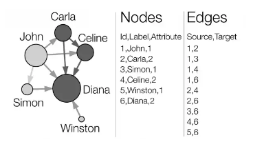
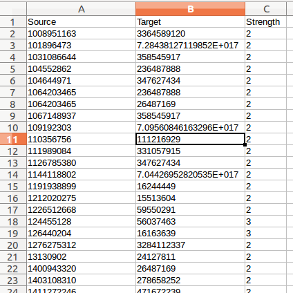
The four SNA tools that will be covered in this tutorial require researchers to organize their data inputs into tables of nodes and edges. Node tables start with a column of node IDs, and may be followed by columns of additional node attributes such as a label or name for the node. Edges start with columns for the source node IDs and target node IDs, and may be following by columns, of additional edge attributes, most notably a measure of the weight of the relationship between the nodes. These two types of inputs are shown in the picture above.
For this tutorial, we will prepare input data using tweets exported from SFM and then extract nodes and edges from the data using the code attached here. Tweets from any other source can be used as well, as long as they are in a line-oriented JSON format.
Exporting tweets from SFM
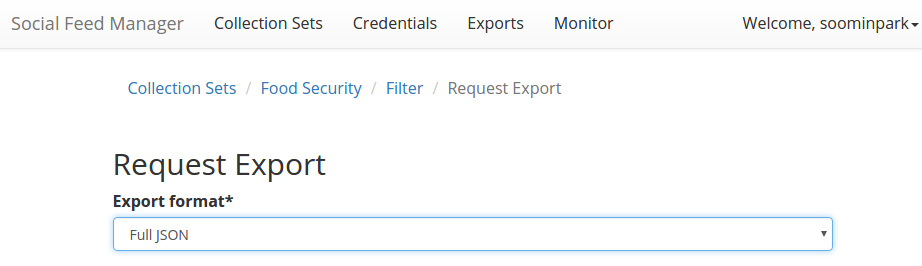
Download the original data of the tweets collection in a Full JSON or CSV format from SFM:
- At the top of the collection’s detail page, click Export.
-
Select the file type as Full JSON or CSV as shown in the picture below:
- Select the export file size you want, based on number of posts per file. Note that larger file sizes will take longer to download.
- Select Deduplicate if you only want one instance of every post. This will clean up your data, but will make the export take longer.
- Item start date/end date allow you to limit the export based on the date each post was created.
- Harvest start date/end date allow you to limit the export based on the harvest dates.
- When you have the settings you want, click Export. You will be redirected to the export page. You will receive an email when your export completes. When the export is complete, the files, along with a README file describing what was included in the export and the collection, will appear for you to click on and download.
Creating your own dataset
Before extracting nodes and edges, you may want to create a subset dataset from the dataset that you exported from SFM. You can use any data processing tool such as Excel, jq, grep, and python. For example, you may want to limit your input data to tweets including terms for specific topics of interest. If you want to get to know how to process json data, check out these useful guides for processing Twitter data with jq:
For this tutorial, we will use the Elites dataset, consisting of the tweets including terms ‘elite’ or ‘elitism’ extracted from our 2016 US Presidential Election. This dataset was built for a researcher’s analysis on the relationship between politics and elitism.
Extracting nodes and edges
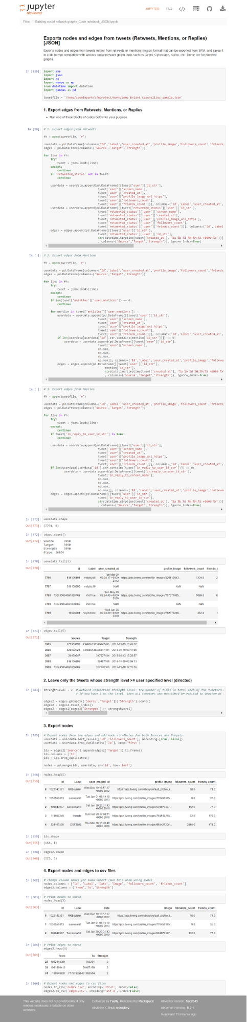
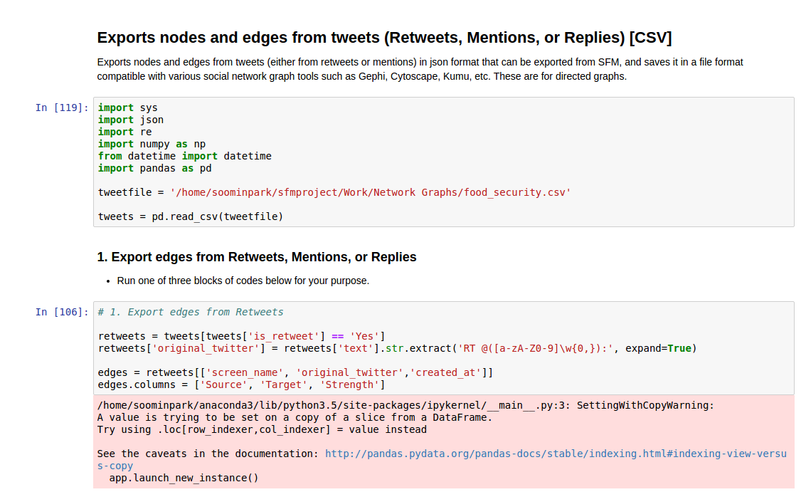
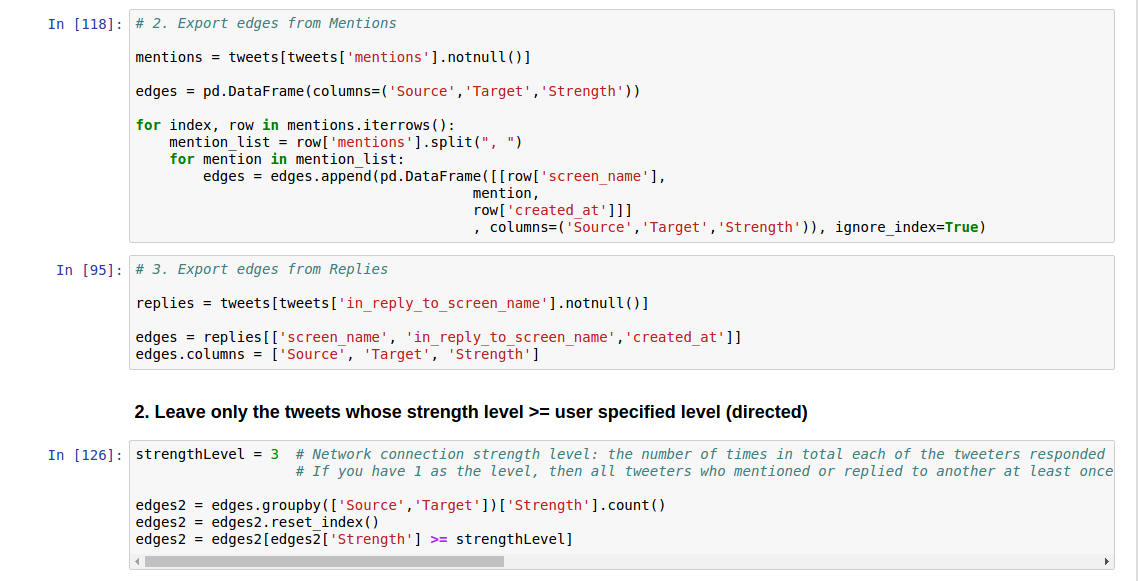
The code presented below will create node and edge input tables for the social network analysis tools from the tweet datasets created in the previous sections. You can build input tables for three types of relationships: retweets, mentions, and replies.
I extracted the screen name, user created date, profile image, followers count, and friends count for node attributes, and strength for the edge attribute. The strength is the number of times in total each of the tweeters responded to/mentioned/retweeted the other. You can add or edit the attributes by modifying the code below.
Note on strength: If you have 1 as the level, then all tweeters who mentioned or replied to another at least once will be displayed. But if you have 5, only those who have mentioned or responded to a particular tweeter at least 5 times will be displayed, which means that only the strongest bonds are shown.
However, please be sure that when using the code below, the node attributes will be completely extracted for all the target nodes ONLY FOR retweets from json datasets. They may not be complete for target nodes for mentions and replies from json datasets and for csv datasets, since json datasets have detailed information only of the retweets targets, and csv datasets do not have any target information.
Using JSON
Using CSV
Input files
The input files for our social network tools created by the above code, are as follows:
Nodes
- Twitter user ID (json) or screen name (csv)
- Attributes
- Label (Screen name)
- User created date [only json]
- Profile image (for Kumu) [only json]
- Number of followers
- Number of friends
For json:
For csv:
Edges
- Source nodes (Source Twitter user ID or screen name)
- Target nodes (Target Twitter user ID or screen name)
- Attribute
- Strength (the number of times in total each of the users retweeted to/responded to/mentioned the other)
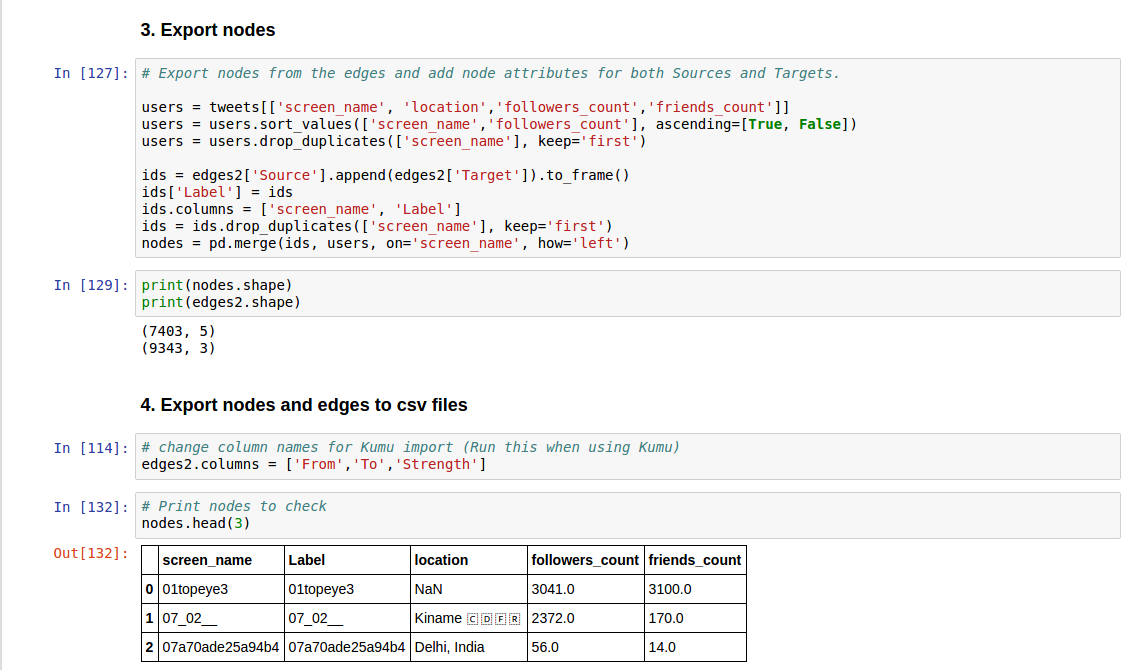
I extracted nodes (3,018 nodes) and edges (3,274 edges) of retweets with a strength greater than 3 from the Elites dataset (json), and we will use these datasets for the rest of this tutorial.
Building network visualization
First, I would like to introduce the tools that we will cover in this section. Gephi, Cytoscape, and igraph are all very popular tools for social network analysis and visualizing networks. Kumu is a relatively new one, but I found it quite useful, especially because it is much easier to use than any other tools. In addition, it is a web-based service and does not require a local installation. Here is a table including brief introductions and pros and cons of each tool based on my experience:
| Tool | Gephi | Kumu | Cytoscape | igraph |
|---|---|---|---|---|
| URL | https://gephi.org/ | https://kumu.io/ | http://www.cytoscape.org | http://igraph.org/r/ |
| Description | An open-source software for visualizing and analysing large networks’ graphs. Created with the idea to be the Photoshop of network visualization, its primary strength is to visualize networks, but basic statistical properties are available as well. Uses a 3D render engine and displays large graphs in real-time. Frequently used in network analyses related to social science and cultural studies. | A web-based visualization platform for tracking and visualizing relationships. Developed to help people better understand complicated relationships easily. | An open-source Java application for visualizing molecular interaction networks. Although originally designed for biological research and most widely used in biology and health sciences, it is a general tool for complex network analysis and visualization, and provides a basic set of features for data integration, analysis, and visualization. | An open-source library collection of network analysis tools with an emphasis on efficiency, portability, and ease of use. |
| Platform | Java | Web (cloud) | Java | R / Python / C/C++ |
| Cost | Free | Free for public projects | Free | Free |
| Tractable number of nodes | Networks up to 100,000 nodes and 1,000,000 edges | Works best up to 10,000 elements and connections | Depends on memory size of machine | More than 1.9 million relations (without attributes) |
| Pros | - No programing knowledge required | - No programing knowledge required | - No programing knowledge required | - Handles very large datasets |
| - Handles relatively large networks (depending on user environments) | - Very easy to use, very simple UI. Good for beginners who do not have in-depth knowledge of network analysis and visualization | Provides enormous library of additional plugins (>250) specifically designed to address and automate biological analyses. Best for biological network analysis | - Powerful analysis functions | |
| - User friendly and intuitive UI | - User friendly UI | - Advantages in using R (cross-platform, import/export any form of data, has a huge library of packages) | ||
| - Produces the highest quality and most attractive visualizations | - Produces high quality visualizations | - Can be used together with other SNA libraries such as Statnet | ||
| Cons | - Not strong network analysis ability | - Not strong network analysis ability | - Requires a steep learning curve to use it and plugins for more advanced tasks | - Requires some knowledge in R programming |
| - Cannot handle large networks | - Text-based, not user-friendly at all | |||
| - Not a visualization tool. Hard to make attractive visualizations |
Reference : A comparative study of social network analysis tools, Empirical Comparison of Visualization Tools for Larger-Scale Network Analysis
In this section, we will briefly find out what each of the four tools is, how to import the data prepared in the previous section to each tool, and how to use each tool to build simple network visualizations with the data. I will also introduce some useful materials for you to learn how to use each tool on your own.
Using Gephi
Gephi is an open-source software for visualizing and analysing large networks graphs. Gephi uses a 3D rendering engine to display graphs in real-time and to speed up exploration. You can use it to explore, analyse, spatialize, filter, clusterize, manipulate and export all types of graphs.
It can be freely downloaded and install instructions are provided. You can also check with its documentation including various tutorials and helpful materials related to Gephi.
Importing Data
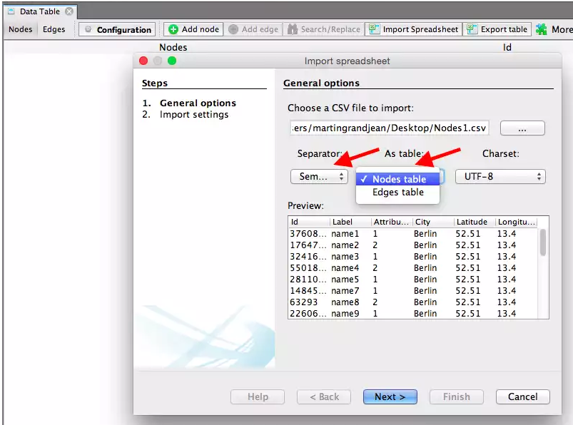
Run the software on your computer and create a new project in the start window. In the Data Laboratory, click on Import Spreadsheet to open the import window and import your nodes.csv and edges.csv files.
Importing Nodes
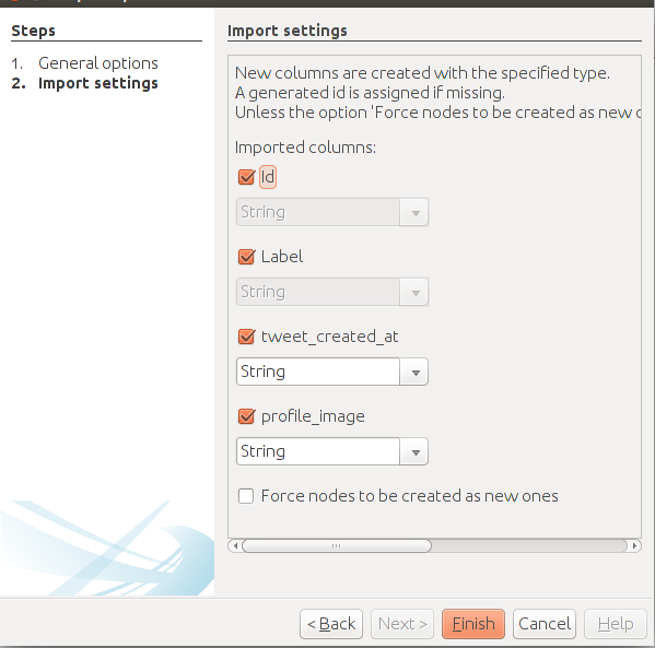
Specify that the separation between your columns is expressed by a semicolon and do not forget to inform Gephi that the file you import contains nodes. Then press next and fill the import settings form as proposed. The import settings step is very important: Gephi will recognize some of the columns because of their header, but you’ll always have to check that the software will be able to understand the nature of your data.
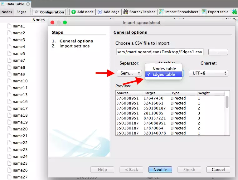
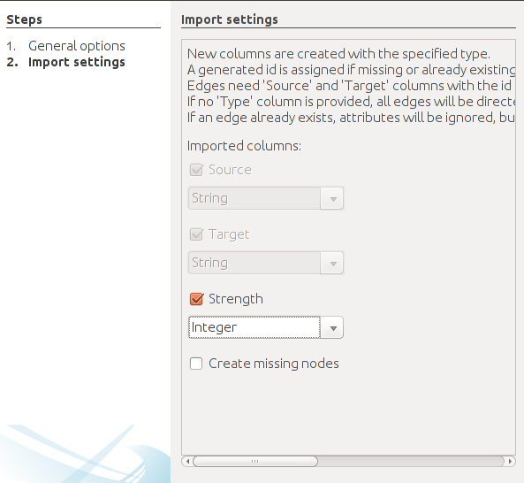
Importing Edges
Follow the same procedure, but with the edges file and fill the forms in the following manner. Specify the semicolon and inform Gephi that you’re importing the edges. Change the file format for Strength to Integer. Fill in the last fields and uncheck create missing nodes because you’ve already imported them.
Graph visualization
For visualization, I will introduce to you a very useful post and a video which introduces the basic concepts of SNA visualizations and step-by-step instructions for building your own visualization with ease:
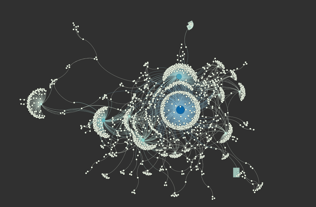
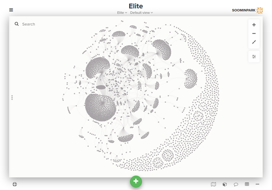
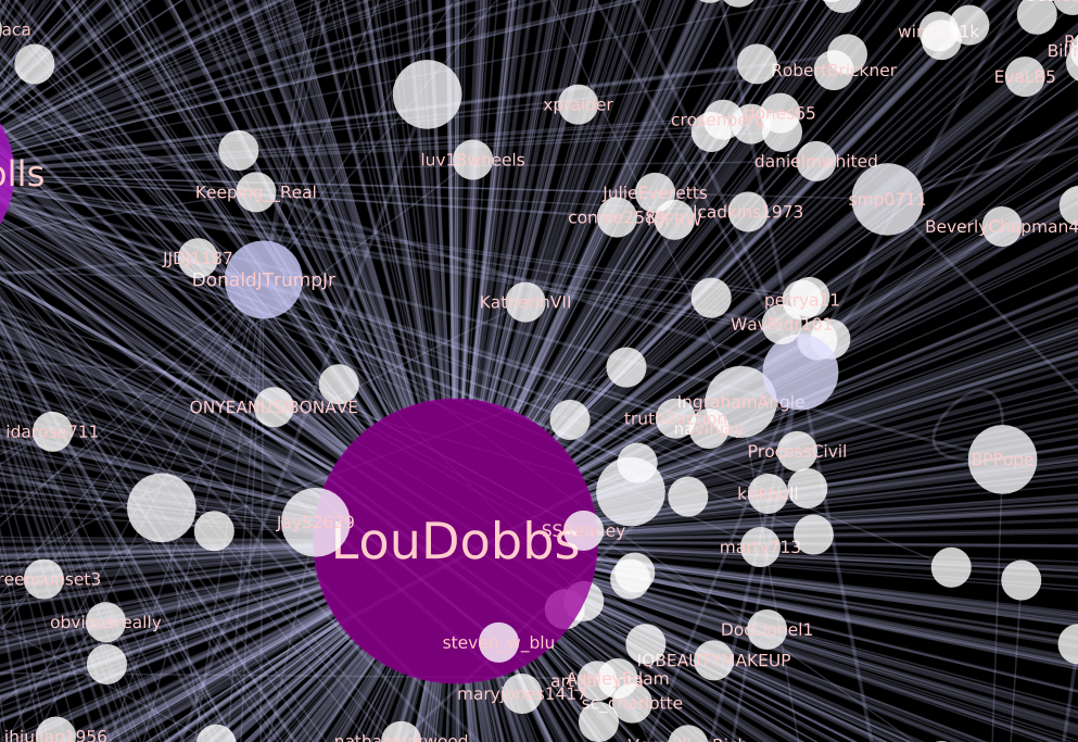
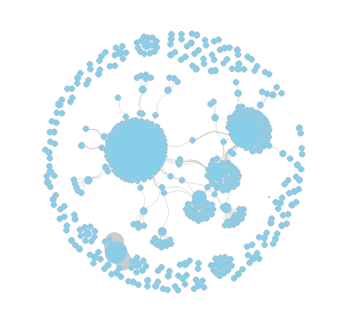
The pictures below are of a visualization that I created with the retweet relationships in the Elite dataset, following the instructions in the links above, using Fruchterman Reingold and Force Atlas 2 to adjust its layout, and changing nodes’ size and coloring nodes according to the number of incoming edges using weighted in-degree that was calculated with the edges’ strength.
Some helpful definitions to understand this:
- In-degree: The number of incoming connections (edges) for an element. In general, elements with high in-degree are the leaders, looked to by others as a source of advice, expertise, or information.
- Weighted in-degree: Like the in-degree, it is based on the number of edges for a node, but ponderated by the weight(strength) of each edge, using the sum of the weight of the edges. For example, a node with 4 incoming edges that weight 1 (1x4=4) is equivalent to a node with 2 incoming edges that weight 2 (2+2=4).
Using Kumu
Kumu is a web-based data visualization tool for tracking and visualizing relationships, giving researchers relatively simple and more accessible ways to build and understand complicated relationships or networks.
To use Kumu, just set up a free account at the Kumu website and log in. You will not need to install anything. Explore the Kumu help docs to learn how to use it more in detail.
Kumu requires its input data to have specific column headers, such as Label for node ID and From, To for Source, Target for edges. It also recognizes some reserved fields and runs special functions for each of the field. For example, it recognizes image URLs in an Image column and displays them on the map. So, I added a code assigning proper column names for input data for Kumu in the code in the early section on preparing data.
Importing Data
I suggest you follow the steps in this blog post and in the Kumu help docs where the process of importing data into Kumu and building visualizations are well explained in detail. You need to create a project first, and select a template among the four maps such as Stakeholder map and Social Network Analysis map. As described in the Kumu docs, the Social Network Analysis map is optimized for performance, so it’s good for handling larger data sets, but at the expense of not allowing you to customize as many aspects of its appearance. I chose the Stakeholder map for this tutorial because it is easier to use for visualization and positions elements automatically by a layout algorithm.
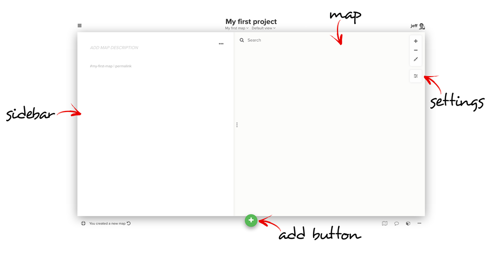
After selecting a template, you will see an empty map as below:
Importing Nodes and Edges
Click on the green + button labeled add button at the bottom of the window and select Import. Kumu will give you some instructions about the information you need to have in the file you’ll upload. Select CSV tab, click Select .csv file, upload nodes.csv, and repeat this process once for edges.csv. After importing (which may take some time depending on the size of your data), you will see your nodes and edges organized automatically, using force-directed layouts where positions are based on relationships as a default setting, as pictured below, without needing to adjust their layout!
Graph visualization
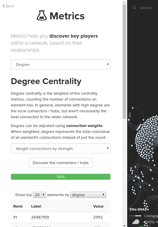
Kumu offers some tools for running a number of popular SNA metrics with ease. You can run the metrics by clicking the Blocks icon in the bottom right of the map and selecting Social Network Analysis. Explore the Kumu help doc to get more detail on what metrics you can run in Kumu and how to run the metrics. For your information, the below screenshot is of the setting I set when I ran Weighted degree metrics selecting Weight connections by strength in the advance options:
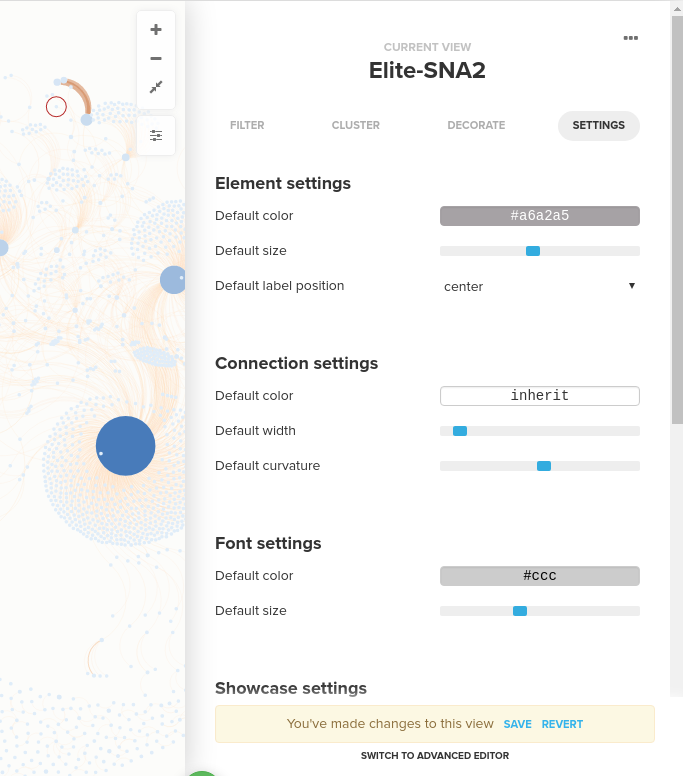
To style your visualization, start by clicking the Settings icon on your map, and you will see the main settings panel that allows you to control some setting for the entire map: element (nodes) and connection (edges) sizes and colors, fonts, layout setting, and so on. To style elements and connections, switch to the Decorate tab at the top of the Settings panel:
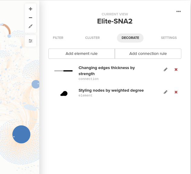
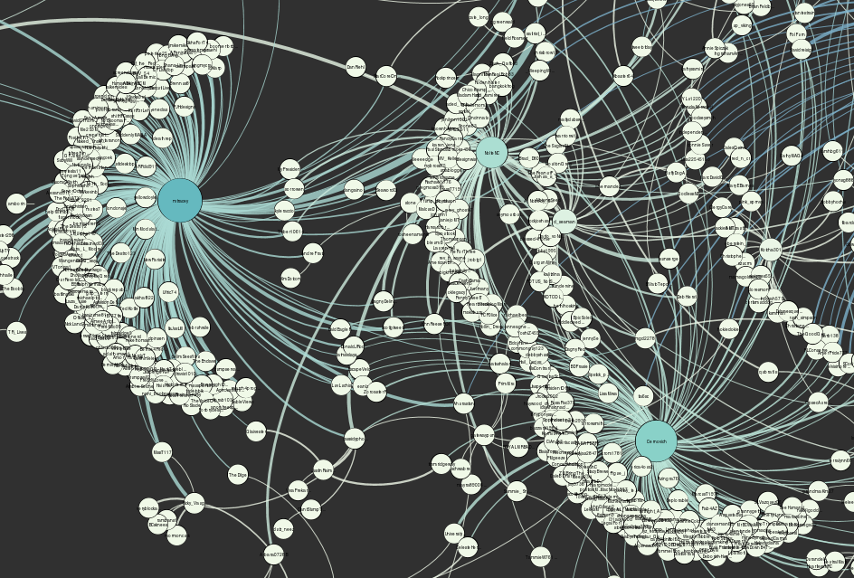
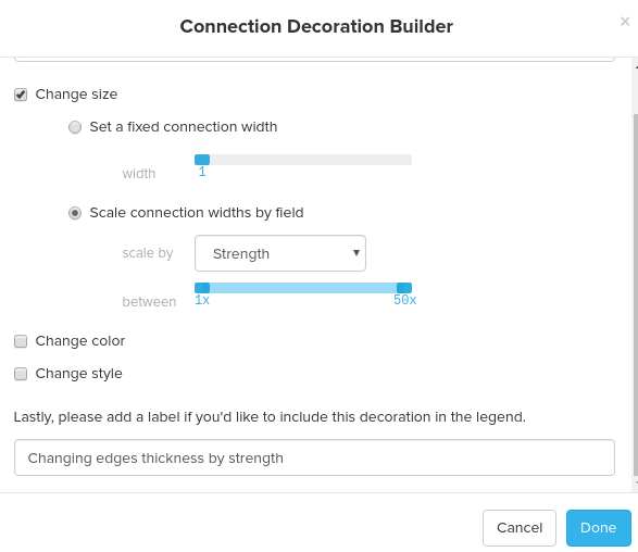
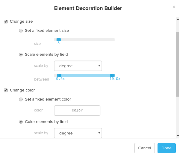
You can style nodes and edges by adding element rules and connection rules. For both element rules and connection rules, you can change size, colors, and style of nodes and edges. For your reference, the screenshots below are the element rule and the connection rule that I set to build the visualization below using the Elite dataset. For the element rule, I changed the size and color of elements by degree and for the connection rule, I changed the size of the edges by strength:
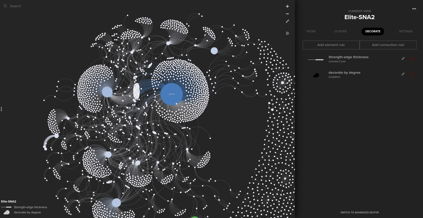
Finally, after changing the background setting to “dark,” I was able to build the network below easily and quickly!
Cytoscape
Cytoscape is an open source software platform and originally designed for visualizing molecular interaction networks for biological research, although it is also used for social network analysis.
It is available for free download. Cytoscape is a Java application, so you need to install Java before running Cytoscape. See the Cytoscape user manual for more information on installation and launching Cytoscape.
You can also check the User Documention page including links to tutorials and helpful materials.
Importing Data
Importing Edges (Network)
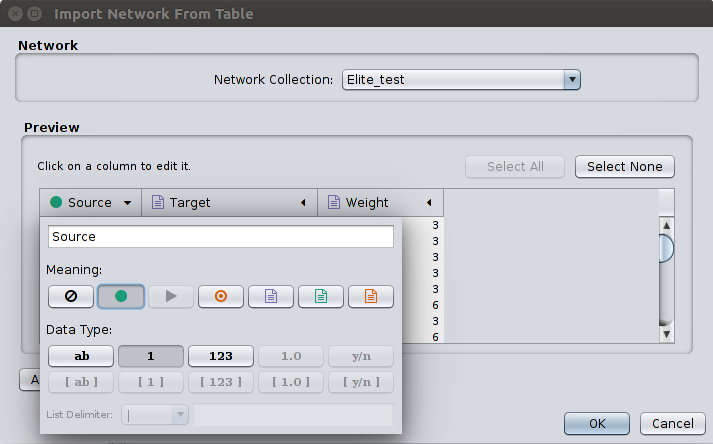
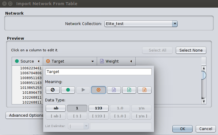
Go to File > Import > Network > File and select our edges.csv file. Then, a window titled Import Network From Table will appear. You should define the interaction parameters by specifying which columns of data contain the Source Interaction and Target Interaction. Clicking on a column header will bring up the interface for selecting source and target. Choose the appropriate Meaning on each Source (a green circle) and Target (a red circle) column as pictured below:
Click OK to upload the dataset, and the data will appear in the graph window.
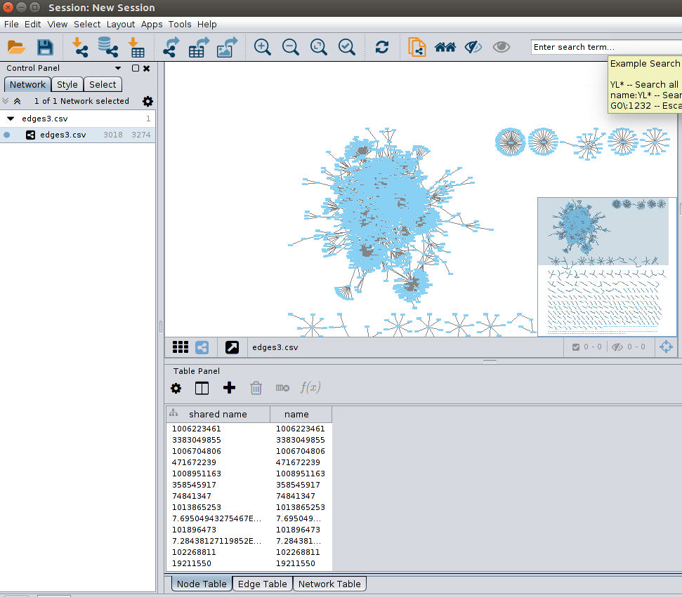
Importing Nodes attributes
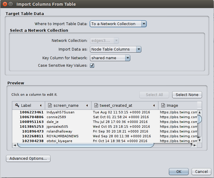
As you can see in the above picture, nodes are actually already in the the Node Table in the Table Panel on the lower right, extracted from the source and the target nodes information in the edges data we imported. There are no nodes attributes yet, but we can add nodes attributes here by importing our nodes.csv file.
Go to File > Import > Table > File and open the nodes.csv file. Then a window titled Import Columns From Table will appear. Set the Import Data as field as Node Table Columns and click OK. You will see more node attributes added in the Node Table in the Table Panel.
Graph visualization
Cytoscape also offers a tool for network analysis called Network Analyzer that is similar to the Statistics interface in Gephi. Running the Network Analyzer (Tools > Network Analyzer > Analyze Network) instructs Cytoscape to run an analysis and display the network metrics in the results panel. Take a look at this Cytoscape documentation to get to know how to run and use the Network Analyzer metrics in more detail.
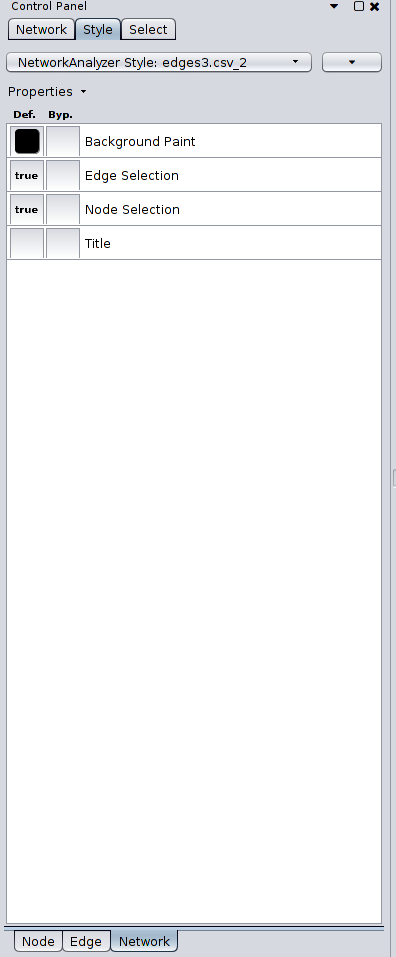
To style your visualization, go to the Control Panel and click on the tab Style. You can customize the visualization using the nodes/edges attributes and the metrics computed from the Network Analyzer. The tab along the bottom of the Control Panel, Node/Edge/Network, will allow you to fine tune the colors, shape, thickness, etc. of the nodes, edges, and network. For example, if you wish to change the background color, you’ll want to click on the Network tab and change the Background Paint.
I suggest that you check the links below to get more information on visualization in Cytoscape:
- Introduction to Network Visualization: Part 2 (Cytoscape): A blog with step-by-step instructions to create a basic visualization
- Detailed explanations about Styles in Cytoscape official manual
- An official Cytoscape tutorial on visualization with adjusting properties in the Control Panel
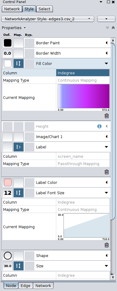
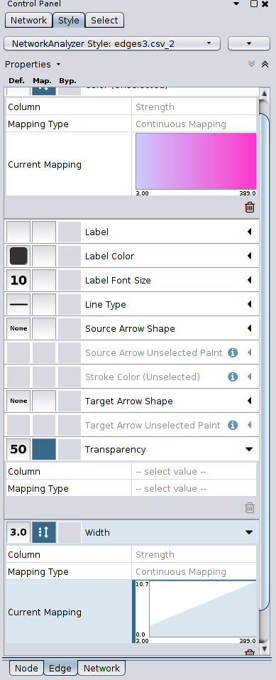
The pictures below are of a visualization that I created with the Elite dataset, following the instructions in the links above, running Force Directed Layout to adjust its layout, changing the size and color of the nodes according to in-degree of each node, and changing the width of the edges using the strength of each edge.
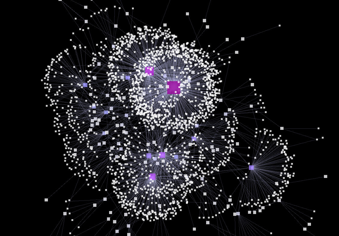
Here are the Style settings for each Node, Edge, and Network that I set for the visualization, for your information:
R Libraries (iGraph)
There are many software packages or tools out there that you can use for social network analysis including those introduced here. However, using the R platform for social network analysis has many advantages due to its flexibility and extensivity. Using R, you can import and export any form of data and conduct network analysis using all the great SNA libraries, such as statnet, RSiena, and igraph, as well as any other tools from R’s huge library of packages. You will need to have some familiarity with using R.
In order to conduct network analysis in R, you need to install R and RStudio. You should also install the latest version of the libraries using the commands below:
    install.packages('statnet')
    install.packages("RSiena")
    install.packages("igraph")
Here are the tutorials on using statnet and igraph that I found very helpful for getting used to these tools:
- igraph vs statnet: A comparison of igraph vs statnet, and a tutorial on using both tools on social network analysis
- A hands-on tutorial on statnet (For statnet, check out the Resources page which includes this tutorial)
- Network Analysis and Visualization with R and igraph: A hands-on tutorial on igraph including a brief R basics
- Network Analysis in R: Another tutorial on igraph
From those tutorials, you can gain enough knowledge or conducting basic social network analysis by yourself. Attached below is my R code using igraph that I ran on the Elite dataset following the third tutorial above:
    # Install igraph and importing the library
    install.packages('igraph')
    library(igraph)

    # Importing data
    nodes <- read.csv("nodes.csv", header=T, as.is=T)
    edges <- read.csv("edges.csv", header=T, as.is=T)


    # Turning the network into igraph objects
    net <- graph_from_data_frame(d=edges, vertices=nodes, directed=T)

    # Simplify the network to remove loops & multiple edges between the same nodes
    net <- simplify(net, remove.multiple=F, remove.loops=T)

    # Remove edges whose strength is less than equal to 5 (in order to reduce nodes and edges to make the graph legible)
    net <- delete_edges(net, E(net)[Strength < 20])
    # Remove the nodes without edges
    iso <- V(net)[degree(net)==0]
    net <- delete.vertices(net, iso)

    # Computing in-degree and weighted in-degree for each node
    V(net)$degree <- degree(net, mode="in")
    E(net)$weight <- E(net)$Strength
    V(net)$weightedDeg <- strength(net, mode="in")

    # Print node and edge attributes
    V(net)$weightedDeg
    V(net)$degree
    E(net)$Strength

    # Visualizing the network
    plot(net,
         vertex.size=5+V(net)$weightedDeg/30, # --> change node size by weighted degree
         vertex.color="skyblue", vertex.frame.color="gray", # --> set node/node frame color
         # vertex.label=V(net)$screen_name, vertex.label.family="sans", vertex.label.cex=.2, vertex.label.cex=.2,  # node label options (not used here in order to make the graph legible)
         vertex.label=NA, # --> set node labels invisible
         edge.arrow.size=0, edge.width=E(net)$Strength/5, edge.color="gray80", edge.curved=.5, # edge options (no arrows, adjust width by strength, set color and curve)
         layout=layout_with_fr)  # --> use the Fruchterman Reingold layout algorithm
One downside of working in R is that it is not a very good environment for building nice visualizations, especially compared to the other SNA tools. R lacks functions for visualization and has a user/graphic-unfriendly environment. Fortunately, data produced in R can be exported in formats readable by the programs like Gephi, so for visualization we can use the tools better for visualization instead.
Conclusion
In this post, I have focused on showing how to import tweet data from SFM to various network analysis and visualization softwares. I have also discussed how to run basic SNA metrics and visualizations using the tools, particularly for researchers who are not familiar with network analyses or with these tools. Even as a non-expert in network analysis, running a network analysis and visualization is not as complicated as I thought when using the proper tools. The tools introduced here have their own pros and cons, and other options are available. If you choose the proper tools for your analysis and follow this tutorial, you can run a basic network analysis and visualization without much difficulty.
For researchers seeking more in-depth knowledge, the next steps could be to learn in greater detail about SNA metrics, how to use those metrics for our analysis and visualization, and how to interpret the results.